

Style Guide Story: Dribbble Image/Prototype Replication....
A design learning experience in KodeCamp.


Table of contents

No headings in the article.
By Alvan Chinagorom Ilo
KodeCamp 2.0 - UI UX Track, Slack, Twitter, Figma : @chinalvanbliss
I wish to share a bit from my KodeCamp Task (4) learning experience which involves Dribble Image replication with style guides for Colour, Typography, and Components.
Method: This activity adopts a concise step-by-step approach with fewer words and expressive graphics.
The Task for UI/UX Beginners:
- Create a style guide for the dribble design link below.
- Using the style guide created, replicate this Dribble Design: dribbble.com/shots/14836845--Exploration-Fa..
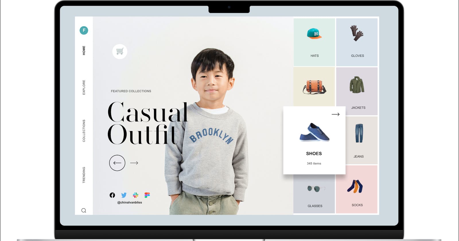
Dribbble Image Prototype/Input
Initial Steps Taken
Aided by "Visual Search Adobe Fonts" identifier, I scanned the Dribbble image to identify the major and minor fonts applied in the original image. The main header identified were AW Conqueror Didot Regular, Tenez Regular, as well as Mencken Std Head Regular. Google Chrome "Font Finder" plugin was also used to confirm the initial findings from Adobe XD text image identification. Visual Search by Adobe XD is available here: https://fonts.adobe.com/fonts/vs/UjdFrvu0RcLlsqHiNN_xvg/results
Snip-cropped the small frame images, imported them in Figma, and used the "Remove bg" plugin to remove the background colours for the shop items. The extracted images (hats, gloves, bags, jeans, shoes, etc) were re-used in the design.
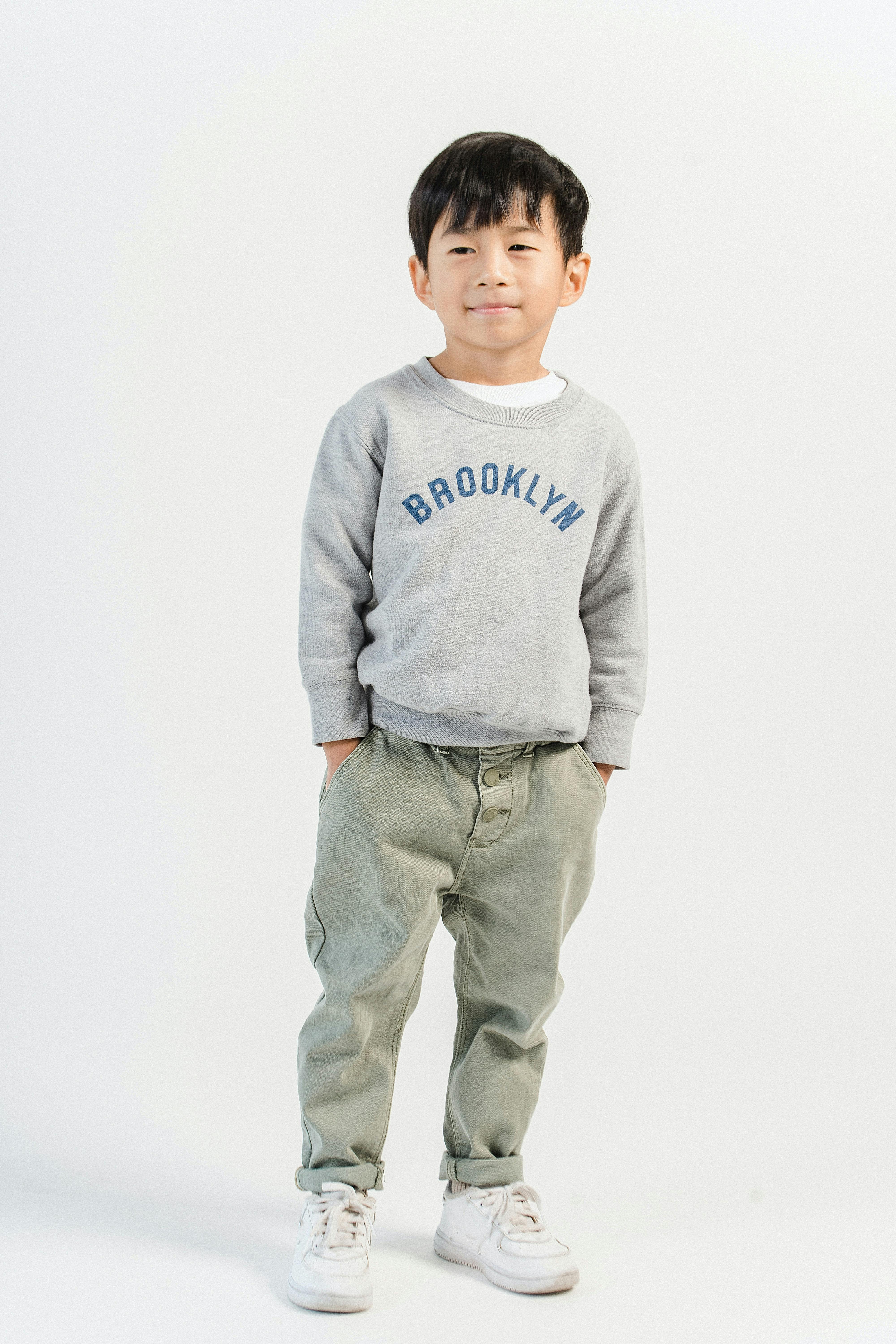
Mined the child image with various image-search tools and search booleans until the image appeared on Pexels.com with image rights belonging to Amina Filkins, a Child Photographer - pexels.com/@amina-filkins
Task Flow for Style Guide
Created a desktop frame (Macbook 14"), imported and embedded the prototype image inside the desktop frame.
Created another three (3) desktop frames of similar properties for Colour, Texts, and Components Style Guides as shown below:
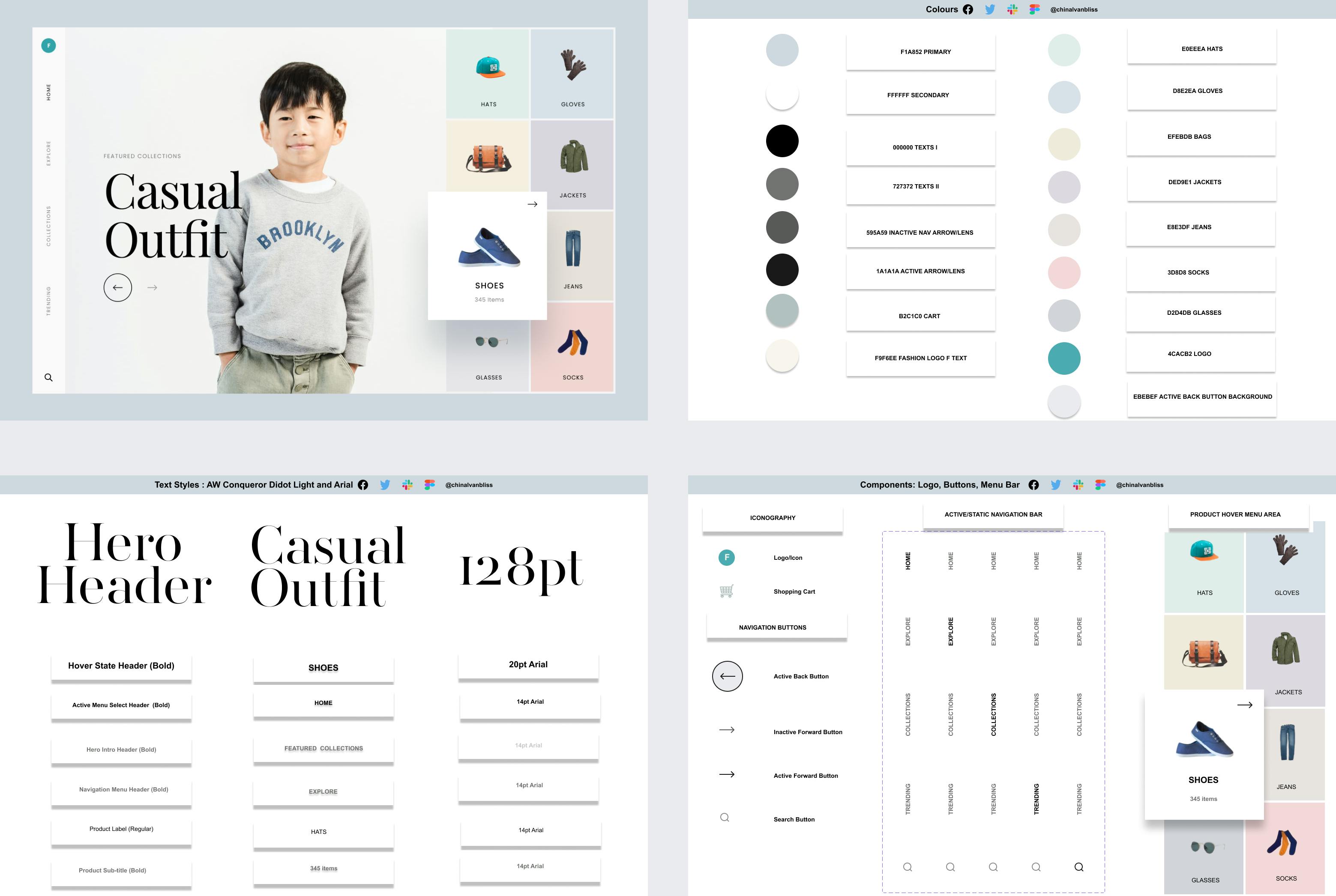
The Colour Style Guide is shown is as:
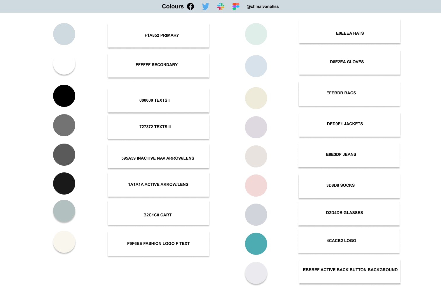
Colour Style GuideFigma "colour dropper tool" was used to identify the image colours and hex codes of the main and minor frames of the prototype. These colours were used to generate the colour style for the re-design. In the colour style guide, new colours were also introduced for the letter "F" in the Logo, two variants of black for black and gray texts, for the shopping cart, as well as a black and gray for active and inactive navigation arrows, respectively.
The Typography Style Guide is shown as:
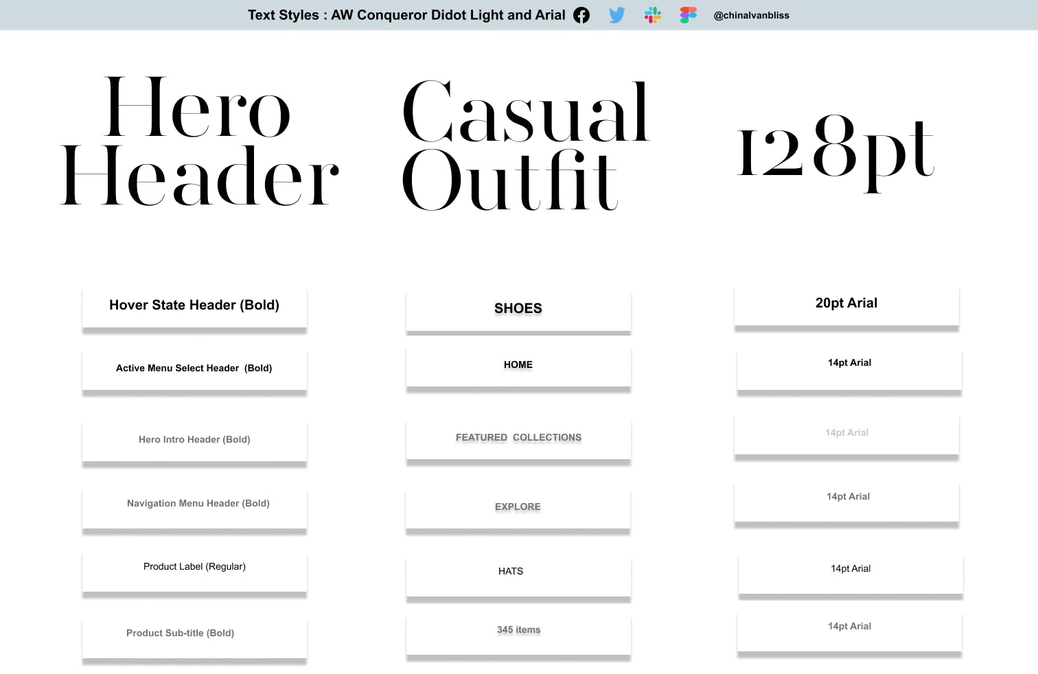
Text Styles: AW Conqueror Didot and ArialText header text (for CASUAL OUTFITS) was created AW Conqueror Didot Light (128pt with 100 line spacing, 0 paragraph spacing, and 0% letter-spacing) while the rest were created with different variants or typefaces of Arial (sizes, bold, regular, block, and small letters) as seen in the plate above.
The Component Style Guide is shown as:
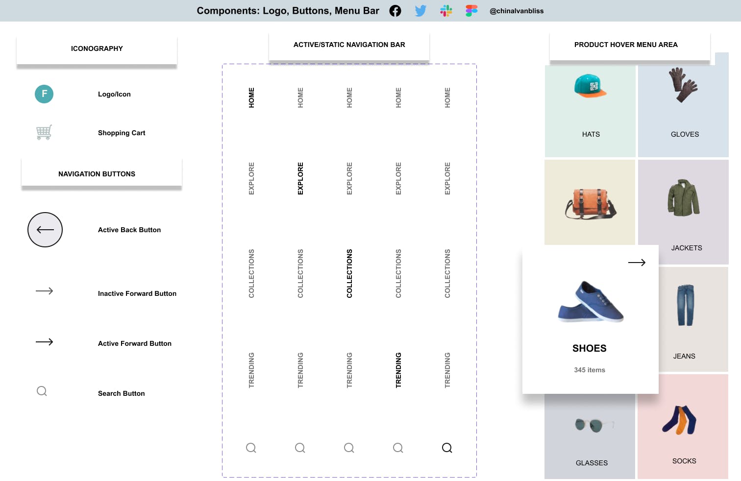
Component Style Guide: Logo, Navigation Bar/Buttons, and MenuThe task flow for the component began with the creation of the logo (first layer - white background of secondary colour in the style guide, a green background eclipse as the second layer, and a beige coloured letter "F" as the third layer of the logo). The three features/layers were "grouped" and converted into a single component that sits atop the navigation bar of the replication on page two.
The shopping cart was imported from iconify and colour styled with the cart colour on the style guide. It is also sitting on a white eclipse background styled with secondary colour from the style guide and changed into a component. Also, the active and inactive navigation arrows were self-created on Figma with the arrow tool while the search button was imported from iconify: all changed to components and styled with appropriate shades of colours.
The navigation bar includes the HOME (styled in black as the active button on the design), EXPLORE, COLLECTIONS, and TRENDING (texts styled in gray as inactive buttons in the design), while the SEARCH BUTTON was imported from iconify. After the necessary adjustments with auto-layout, the navigation bar was converted to a single component of two shades of colour styles: black for the active button and grey for the inactive buttons on a diagonal axis as seen in the component plate above.
The variants were created from the original component with EXPLORE, COLLECTIONS, TRENDING, and SEARCH buttons getting a share of the black colour style as active buttons while the rest were placed in an inactive state at various moments. Lastly, the original components were copied to the replication such that any alteration in the main component reflects on the design in terms of colours, texts, and components.
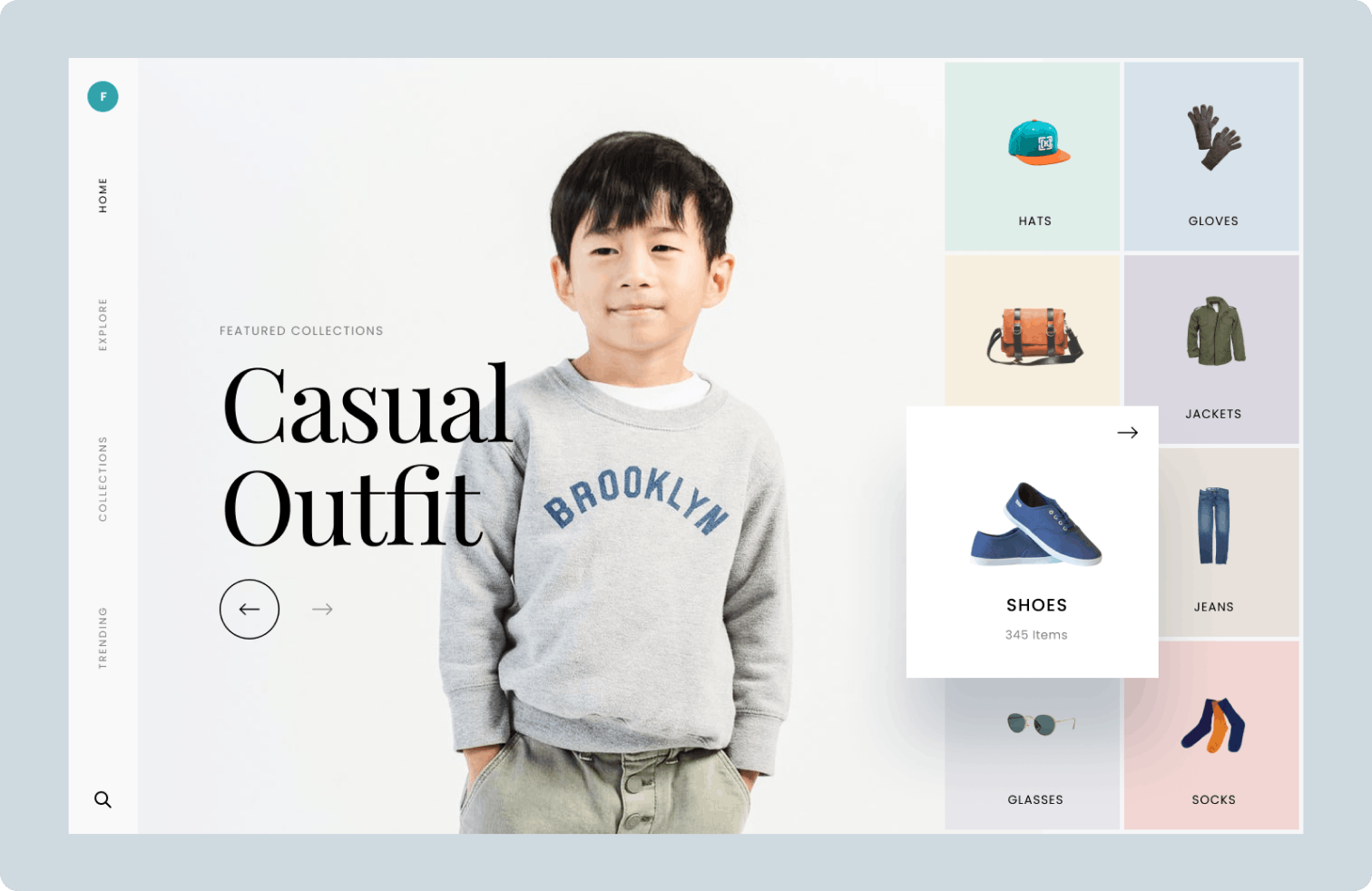
The Replication is shown as:
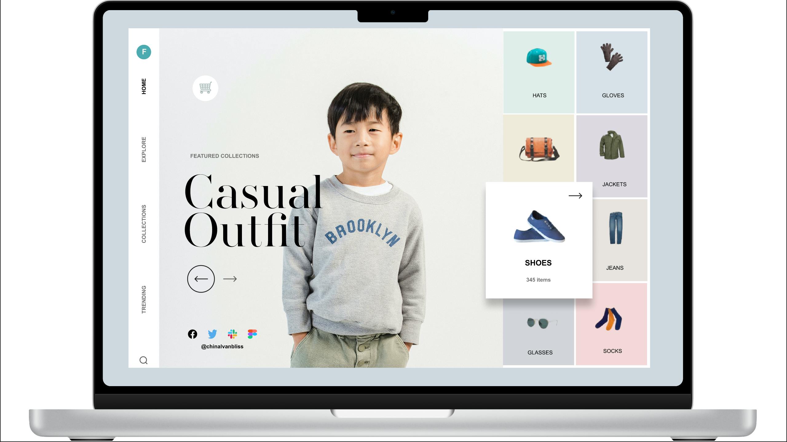
This image is the end product of the replication exercise.
Task Flow for Design Replication:
First off, the outermost border was created and styled with the primary colour.
The logo was copied as a component to its point on the design.
Below the logo, the navigation bar was placed as a frame and component to make a seamless vertical feature.
A big frame was created as a container or structure for the smaller (product frames) and styled with primary colour reflecting (as white) in the gutters between product images.
A central and the biggest (image) frame aligned between the navigation bar and the product image structure frame was used to import the CHILD IMAGE and cropped to fit as seen on the original photo (cropped at waistline).
The replication was prototyped on Figma and captured on a laptop screen with Windows + Prt sc ( Windows print screen). It can also be exported in various formats (PNG, PDF, etc) on Figma with the shortcut (Windows: Shift + Ctrl + E) and (Mac: Shift Command E).
Miscellaneous is shown as:
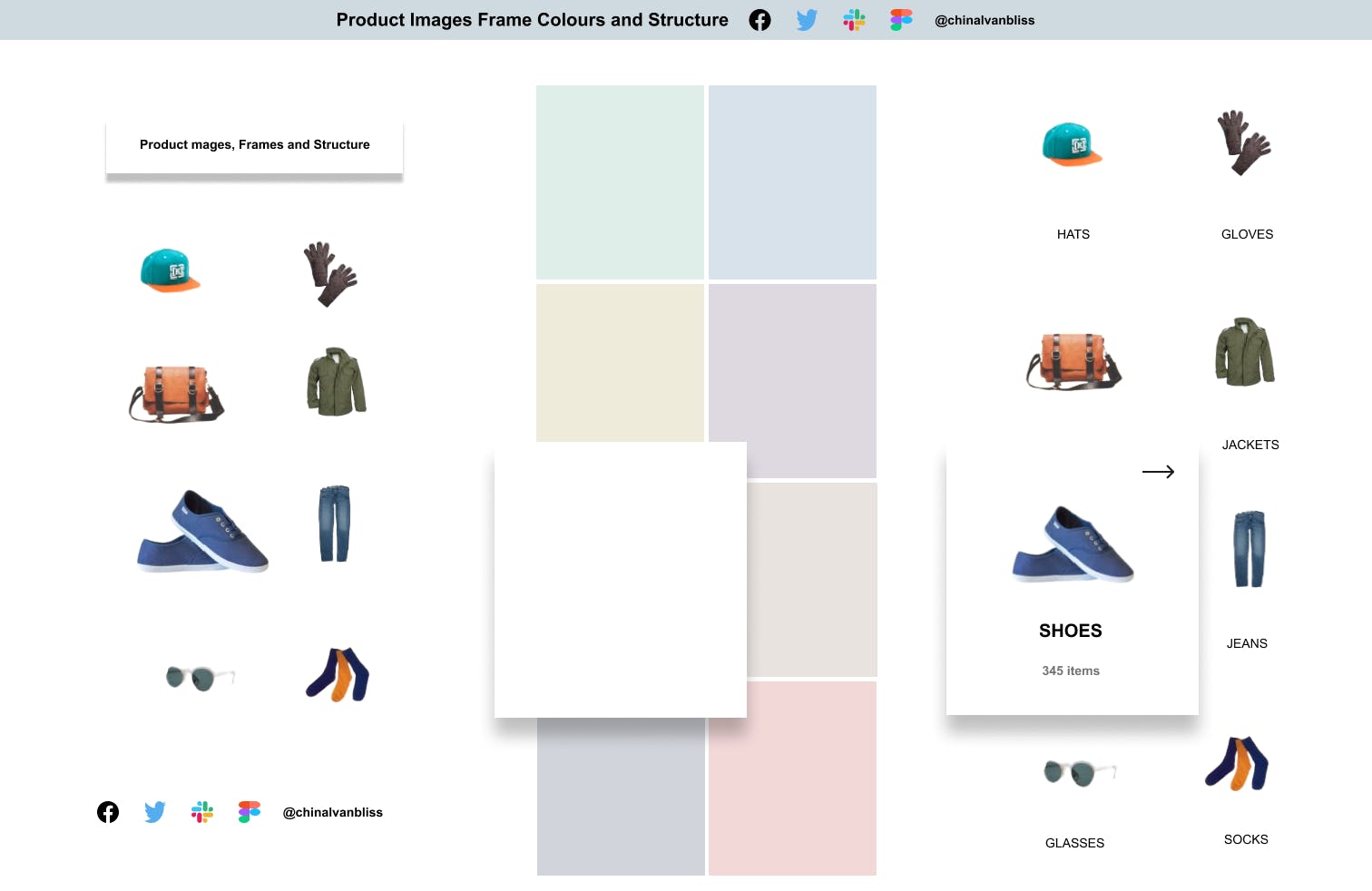 Miscellaneous Images, Frame, Structures, and Effects
On the right of this image are the extracted images used in the replication. In the middle is a structure of the product frames on which the product images were introduced to form a whole. The overlapping "SHOES" frame was achieved with the EFFECT tool. The effect tool is located before the Export button at the button right of Figma workspace. A click at EFFECTS produces a DROP SHADOW.
A click at drop shadow produces further details for manipulation of shadow, blur, etc using the Y, X, SPREAD, and BLUR. For instance, Y=20, BLUR = 20 will overlap the feature as seen on the shoe frame above while further increment or a decrease would cast a higher and lower shadow behind the feature respectively.
So, here is a picture of the journey so far. A tough but rewarding formation:
Original Image 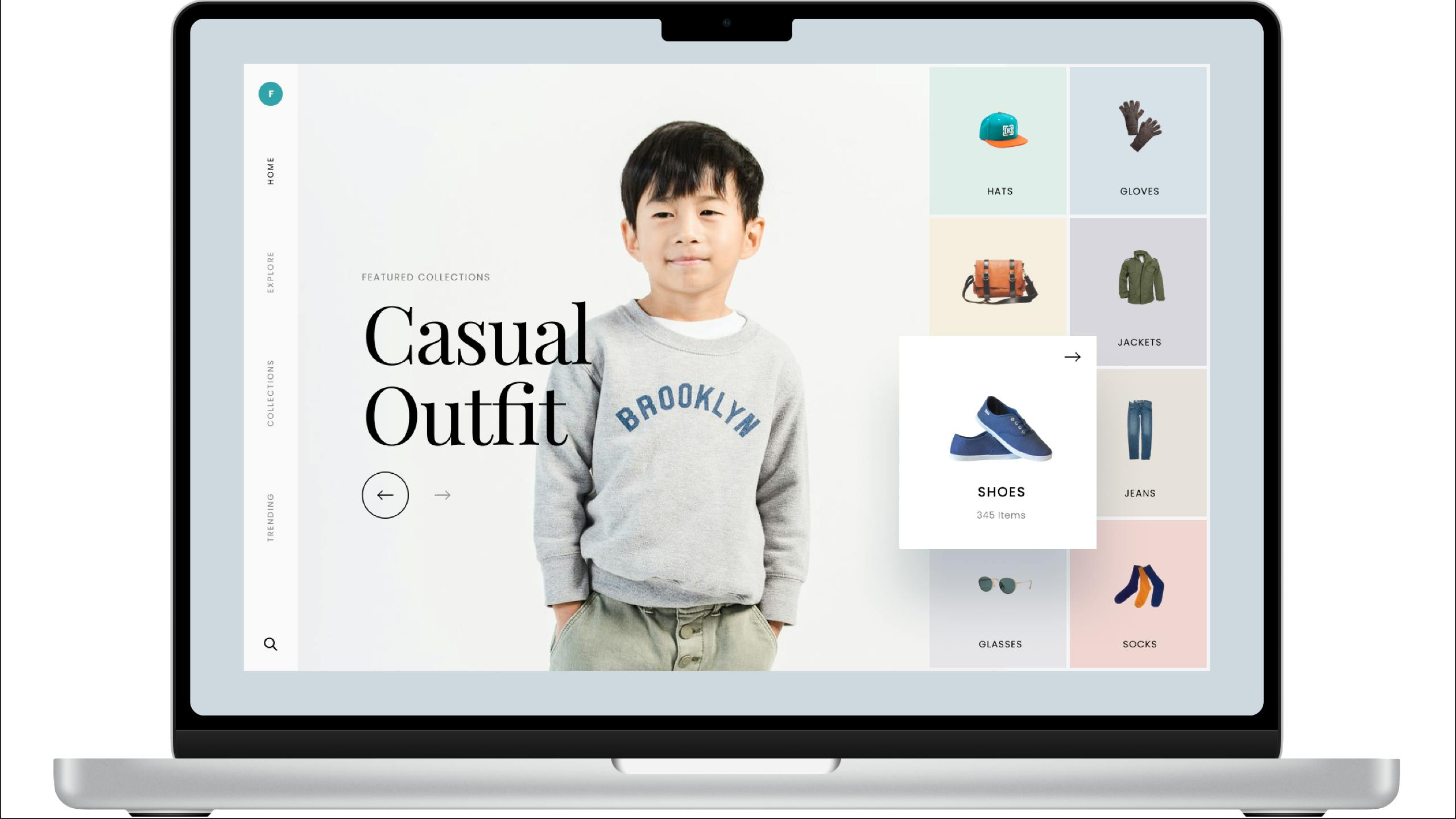
Replicated Image 
Cheers,
The KodeCamp Team, Mentors, and Co-learners.